| Product | iOS APP (restyling) |
| Client | Student project |
| Language | Swift |
| Softwares | Adobe XD, Xcode |
About
Monefy is an existing app that let you keep track of your incomes and your expenses.
I started to use the app because I needed to figure out how I was using my money, and the free version of
this app was perfect since it has all the features I need:
- Incomes and expenses tracking
- Balance overview
- Possibility to add and manage multiple accounts.
In spite of that, from the first use of the application, you can immediately spot the weaknesses of the UX (and of the UI too). That's why I decided to focus on three main screen of the app and try to improve it according to my vision.
Also, I wanted to improve my knowledge in data handling using SwiftUI, therefore this application was ideal for my purposes.
Starting point and analysis
The screen I decided to focus on are:
1) The first screen, with the general overview
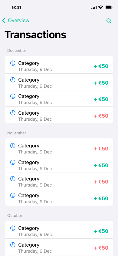
2) The list with all the transactions
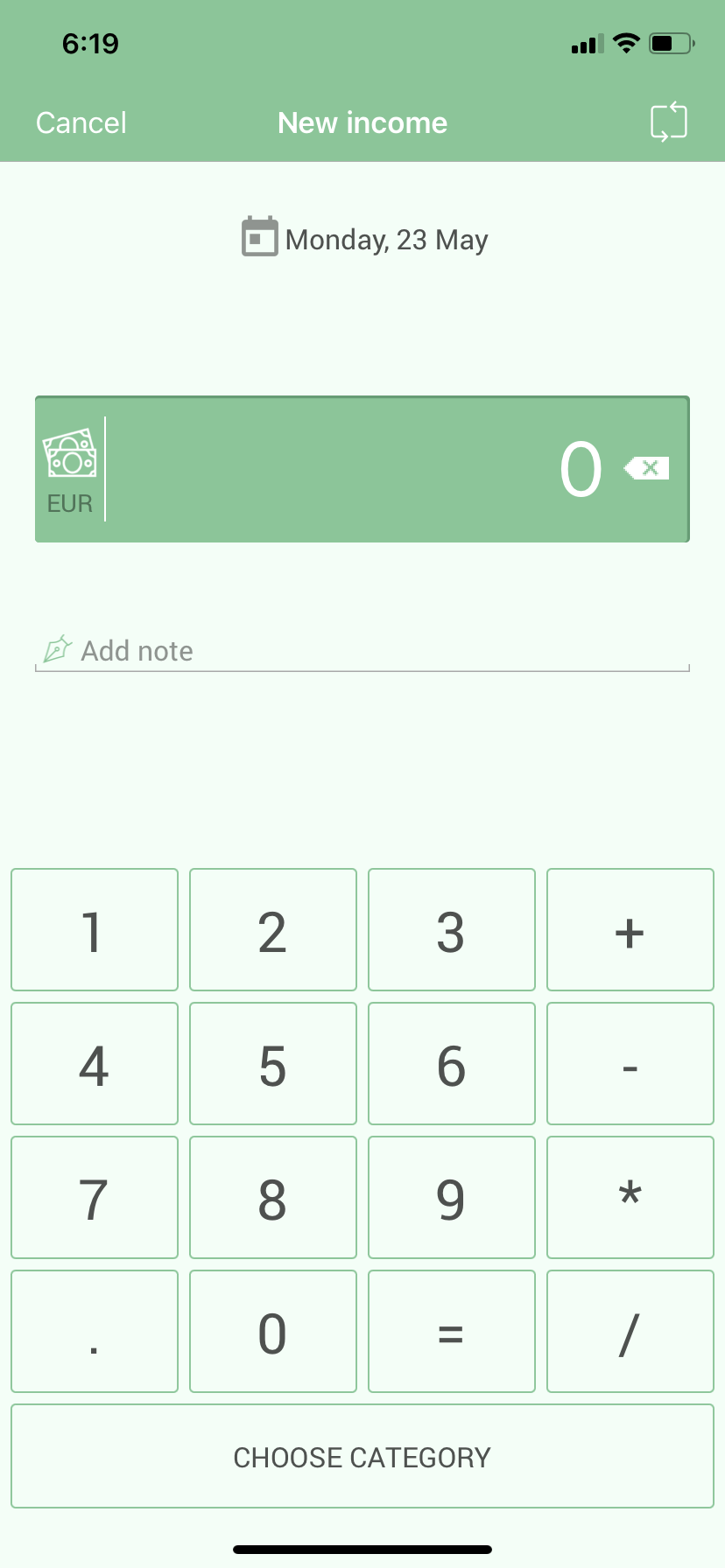
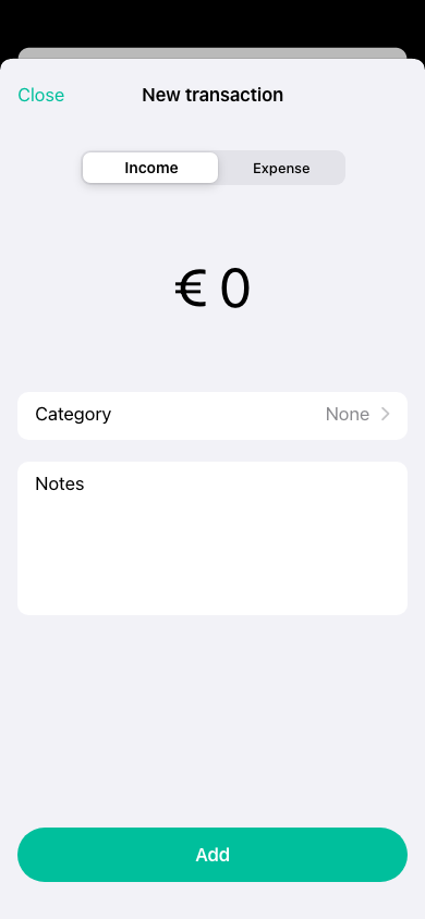
3) The screen through which is possble to add new transactions.
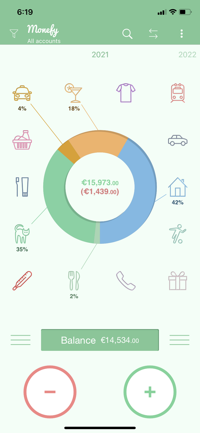
The first screen is visibly too messed up:
- The navigation bar contains too many elements; in addition, the logo should
not be repeated within an app.
- The chart in the center, in my opinion, is difficult to read and interpret
voluptuously, also because there are too many categories
- Furthermore, in the middle there are two digits, respectively the money earned and the money spent in a
given period, information that I consider to be secondary to the balance,
placed instead at the bottom
(that's also the way tou can access the list of all your transactions).
- Finally the buttons at the bottom to add a gain or an expense are
unsightly.
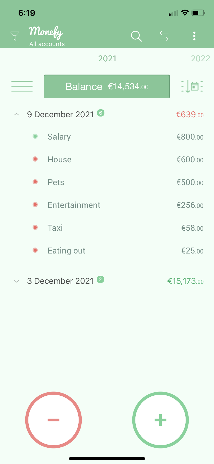
About the other two screens, the UX is quite ok, but a general restyle in design can give them a better look.
Final result
This is the result of the UX and UI restyling I made:
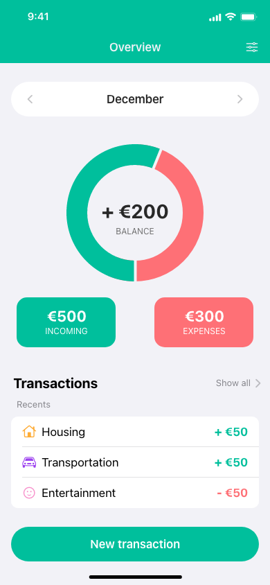
Here they are the main improvements:
- The navigation bar in now a lot more clean.
- The chart in the center now only returns the balance, that is also written in its center, while the detail of incomes and expenses are placed just below it.
- A quick overview of the last transactions is now present in the main screen, with the possibility to see the whole list by simply tapping on "Show all"
- A single button to add new transactions replaced the old two buttons, and it opens a modal view istead of a new screen.
- Colors have been made brighter, so that the app has a more pleasant look.